Kode Era: 🔵 Classic | 🟢 Modern | 🔴 Research/Frontier | 🔥 Sedang Tren (2024–2025)
Daftar Isi
- SEDANG TREN SAAT INI (2024–2025)
- Minimalism & Flat Design
- Skeuomorphism & Realism
- Brutalism & Anti-Design
- Retro & Historical Revivals
- Expressive & Brand-Led Design
- Typography-Led Design
- Layout Systems & Grid
- Motion & Interaction Design
- Color & Visual System
- Data Visualization & Dashboard
- Accessibility & Inclusive Design
- Immersive & Emerging Interfaces
- Performance & Engineering-Led Design
SEDANG TREN SAAT INI (2024–2025)
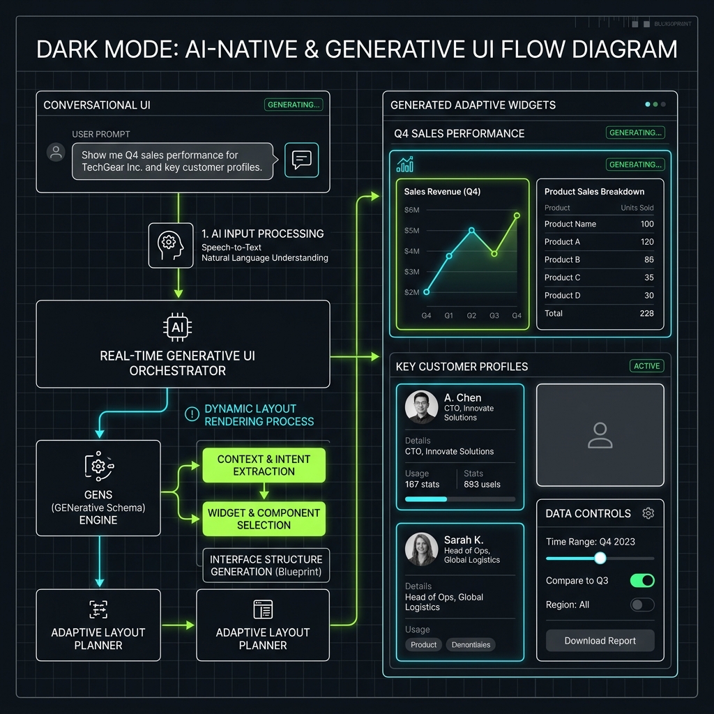
AI-Native & Generative UI
| Style | Era | Penggunaan | Karakteristik Utama | Contoh |
|---|---|---|---|---|
| AI-Generated UI | 🔥 Tren | SaaS, AI tools, auto-generated layouts | Layout adaptif per context; LLM-driven component generation; Personalized interface rendering | v0.dev, Vercel AI SDK UI, Galileo AI |
| Conversational UI (CUI) | 🔥 Tren | Chatbot, assistant, customer service | Chat-first interaction; Progressive disclosure via dialogue; Inline rich responses | ChatGPT, Claude, Copilot |
| Generative Design Systems | 🔥 Tren | Design tools, creative platforms | AI-suggested color palettes; Auto-responsive component variants; Token generation from brand | Adobe Firefly, Figma AI |
Deskripsi:
- AI-Generated UI: UI yang seluruhnya atau sebagian dibuat oleh AI secara real-time; konten dan layout adaptif per user.
- Conversational UI: Interface utama adalah percakapan teks atau suara; elemen visual sebagai komplemen.
- Generative Design Systems: Design token dan komponen dihasilkan atau diadaptasi secara programatik oleh AI.
Berikut adalah Cetak Biru Alur Kerja AI-Native & Generative UI yang memvisualisasikan bagaimana kueri percakapan pengguna (Conversational UI) diterjemahkan secara waktu-nyata (Real-Time Orchestrator) menjadi tata letak komponen adaptif yang personal (Generated Adaptive Widgets):
Visual Language Tren
| Style | Era | Penggunaan | Karakteristik Utama | Contoh |
|---|---|---|---|---|
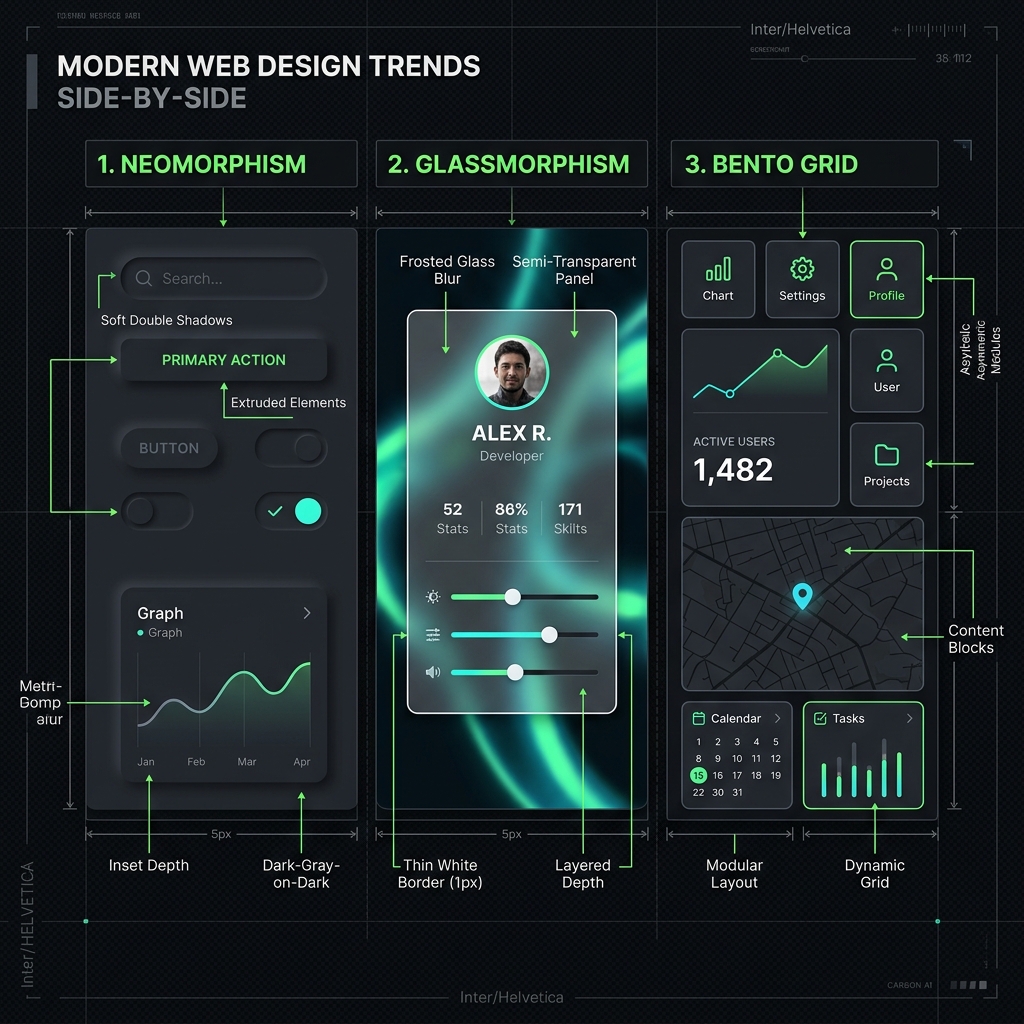
| Glassmorphism | 🔥 Tren | Dashboard, app landing page, SaaS | backdrop-filter: blur(); Semi-transparent cards; Layered depth illusion | Apple macOS Big Sur UI, iOS widgets |
| Neomorphism (Neumorphism) | 🔥 Tren | Mobile app, dashboard widget | Monochromatic palette; Dual soft shadows (light + dark); Extruded UI elements | Dribbble design shots, app UI kits |
| Bento Grid | 🔥 Tren | Portfolio, product page, dashboard | Asymmetric grid cells; Mixed content types per cell; Apple-inspired editorial grid | Apple WWDC pages, Linear, Raycast |
| Dark Mode First | 🔥 Tren | Developer tools, creative apps, premium SaaS | Dark-native color system; High contrast on dark bg; Reduced eye strain focus | GitHub, Vercel, Linear, Figma |
| Variable Fonts & Kinetic Typography | 🔥 Tren | Agency, editorial, interactive art | Font axis animation; Scroll-driven weight changes; Typography as hero element | NY Times, The Pudding, awwwards winners |
| 3D & WebGL Immersive | 🔥 Tren | Product showcase, agency, portfolio | Real-time 3D rendering; Scroll-triggered 3D animation; GPU-based visual effects | Stripe, Apple, Bruno Simon portfolio |
| Scrollytelling | 🔥 Tren | Journalism, case study, explainer | Scroll-triggered reveals; Sticky narrative anchors; Data viz synchronized with prose | NYT Upshot, The Pudding, Bloomberg |
| Monochromatic Minimalism | 🔥 Tren | Luxury brand, editorial, premium SaaS | Single-hue or B&W palette; White space as design element; Typography-led hierarchy | Arc Browser, Notion, Craft |
| Micro-interactions & Motion Design | 🔥 Tren | SaaS, mobile app, consumer product | Spring physics animations; Purposeful micro-feedback; Choreographed page transitions | Vercel, Linear, Framer Motion showcase |
| Editorial / Magazine Layout | 🔥 Tren | Content platform, media, storytelling | Asymmetric column layouts; Editorial typographic hierarchy; Mixed-weight headline styles | Readymag, Substack, Are.na |
Deskripsi:
- Glassmorphism: Frosted glass effect: latar transparan dengan blur, border semi-transparan, dan highlight subtle.
- Neomorphism: Skeuomorphism modern: elemen terasa raised atau pressed dari surface menggunakan double soft shadow.
- Bento Grid: Layout grid asymmetris terinspirasi kotak bento Jepang; modul berbeda ukuran dalam grid.
- Dark Mode First: Dark sebagai mode utama bukan opsional; warna dan contrast dirancang untuk dark environment.
- Variable Fonts: Font dengan axis yang bisa dianimasi (weight, width, optical size); tipografi bergerak sebagai UI element.
- 3D & WebGL Immersive: Three.js/WebGL untuk 3D product viewer, parallax depth, atau full 3D environment di browser.
- Scrollytelling: Narasi yang terungkap seiring user scroll; kombinasi teks, ilustrasi, dan data visualization.
- Monochromatic Minimalism: Palet warna sangat terbatas (satu warna atau hitam-putih) dengan tipografi yang kuat.
- Micro-interactions: Animasi halus di setiap interaksi kecil; hover state, loading, transition, dan feedback.
- Editorial Layout: Layout terinspirasi majalah cetak: kolom asimetris, large pull quotes, full-bleed imagery.
Berikut adalah Cetak Biru Perbandingan Tren Visual Side-by-Side yang membandingkan karakteristik visual antara Neomorphism (soft double shadows), Glassmorphism (frosted glass blur & thin border), serta Bento Grid (asymmetric modular layout):
Interaksi & Navigasi Tren
| Style | Era | Penggunaan | Karakteristik Utama | Contoh |
|---|---|---|---|---|
| Floating Action & Command Palette | 🔥 Tren | Productivity app, SaaS, developer tools | Keyboard-first interaction; Fuzzy search navigation; Contextual quick actions | Linear, Notion, Raycast, GitHub |
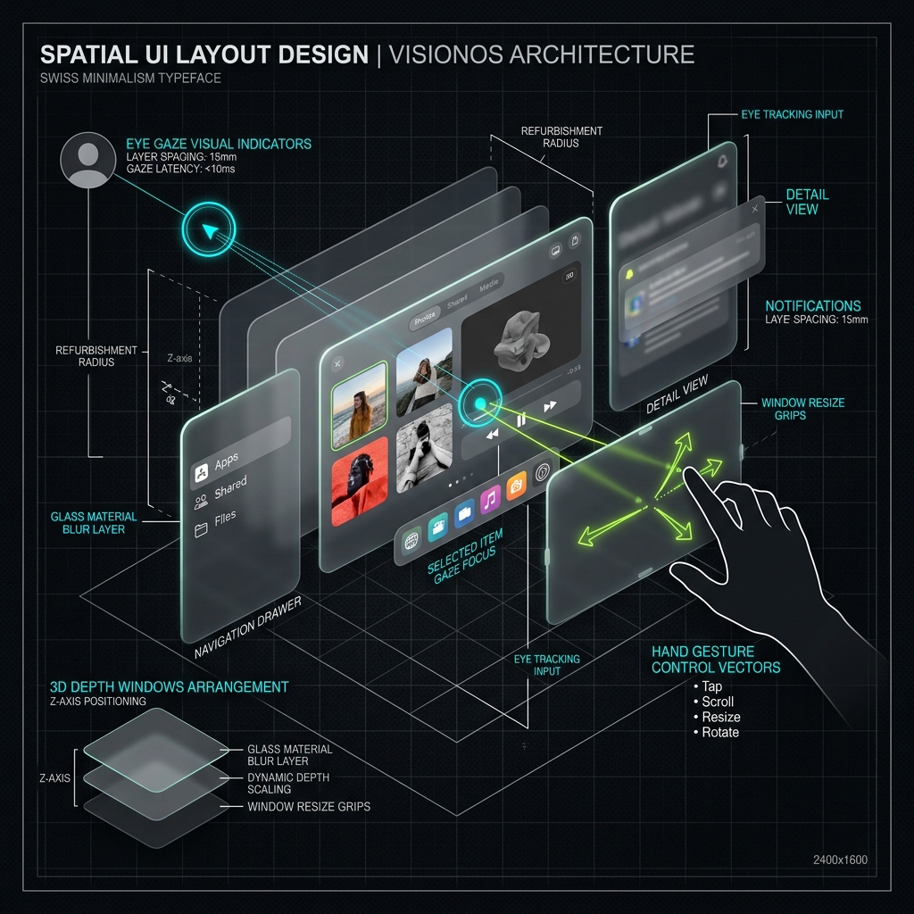
| Spatial UI | 🔥 Tren | AR/VR, Apple Vision Pro, spatial computing | Depth-layered panels; Gaze + pinch interaction; Ambient spatial context | Apple Vision Pro visionOS, Meta Quest |
| Bottom Sheet & Drawer Navigation | 🔥 Tren | Mobile web, PWA, app-like web | Swipe-up sheet panels; Persistent bottom nav bar; App-like mobile navigation | Vercel mobile, Shopify mobile |
Deskripsi:
- Floating Action & Command Palette: Navigasi cepat berbasis keyboard dan pencarian fuzzy untuk pintasan aksi kontekstual.
- Spatial UI: Antarmuka dengan kedalaman 3D berlapis yang dioptimalkan untuk pandangan mata (gaze) dan gestur jari.
- Bottom Sheet & Drawer Navigation: Laci panel yang dapat ditarik dari bawah untuk interaksi mobile satu tangan yang ergonomis.
Berikut adalah Cetak Biru Desain Tata Letak Spatial UI yang menggambarkan interaksi penelusuran pandangan mata (eye gaze), kontrol gestur tangan, serta arsitektur kedalaman jendela 3D (Z-axis positioning):
1. Minimalism & Flat Design
1.1 Foundation Minimalist
| Style | Era | Penggunaan | Karakteristik Utama | Contoh |
|---|---|---|---|---|
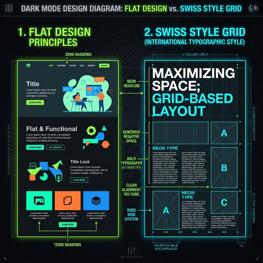
| Flat Design | 🔵 Classic | App UI, icon design, infographic | No skeuomorphism; Bold solid colors; Simple geometric icons | Windows 8/Metro, iOS 7+, Google Material |
| Swiss / International Style | 🔵 Classic | Corporate identity, editorial, branding | Mathematical grid system; Helvetica dominance; Asymmetric yet balanced layout | Swiss railway posters, Vignelli NYC subway |
| Material Design | 🟢 Modern | Android, web app, Google products | Elevation through shadow; Meaningful motion; Baseline 8px grid | Google apps, Android system UI |
| Material Design 3 (You) | 🟢 Modern | Android 12+, adaptive apps | Dynamic color generation; Tonal surface palette; Adaptive component tokens | Android 12/13, Google apps |
| Apple Human Interface Guidelines | 🟢 Modern | iOS, macOS, watchOS, tvOS | SF Symbols icon system; Translucent materials; Platform-idiomatic patterns | iOS system apps, App Store featured apps |
| Scandinavian Minimalism | 🟢 Modern | E-commerce, lifestyle brand, editorial | Natural material tones; Generous negative space; Functional beauty ethos | Muji website, Hay, Aesop |
| Zen / Wabi-Sabi | 🟢 Modern | Luxury, wellness, artisan brand | Deliberate imperfection; Earth tone palette; Handcraft texture cues | Kinfolk magazine, Japanese brand sites |
Deskripsi:
- Flat Design: Menghilangkan semua ornamen 3D; warna solid, ikon datar, tipografi bersih. Dipopulerkan oleh Microsoft Metro dan iOS 7.
- Swiss / International Style: Tipografi sans-serif, grid matematis, alignment strict, dan whitespace deliberate. Akar dari semua desain modern.
- Material Design: Google's design language: elevation via shadow, motion meaningful, color system komprehensif.
- Material You (M3): Dynamic color dari wallpaper; personalized theming via Monet algorithm.
- Apple HIG: Clarity, deference, depth — Apple's tri-principle framework untuk native platform UI.
- Scandinavian Minimalism: Sangat bersih, natural material palette, generous whitespace, subtle typography.
- Wabi-Sabi: Imperfection sebagai estetika; asymmetry, subtle texture, muted earth tones.
Berikut adalah Cetak Biru Desain Minimalis & Grid yang membandingkan kesederhanaan geometris tanpa bayangan (Flat Design) dengan keteraturan tata letak berbasis kisi matematis (Swiss Style Grid):
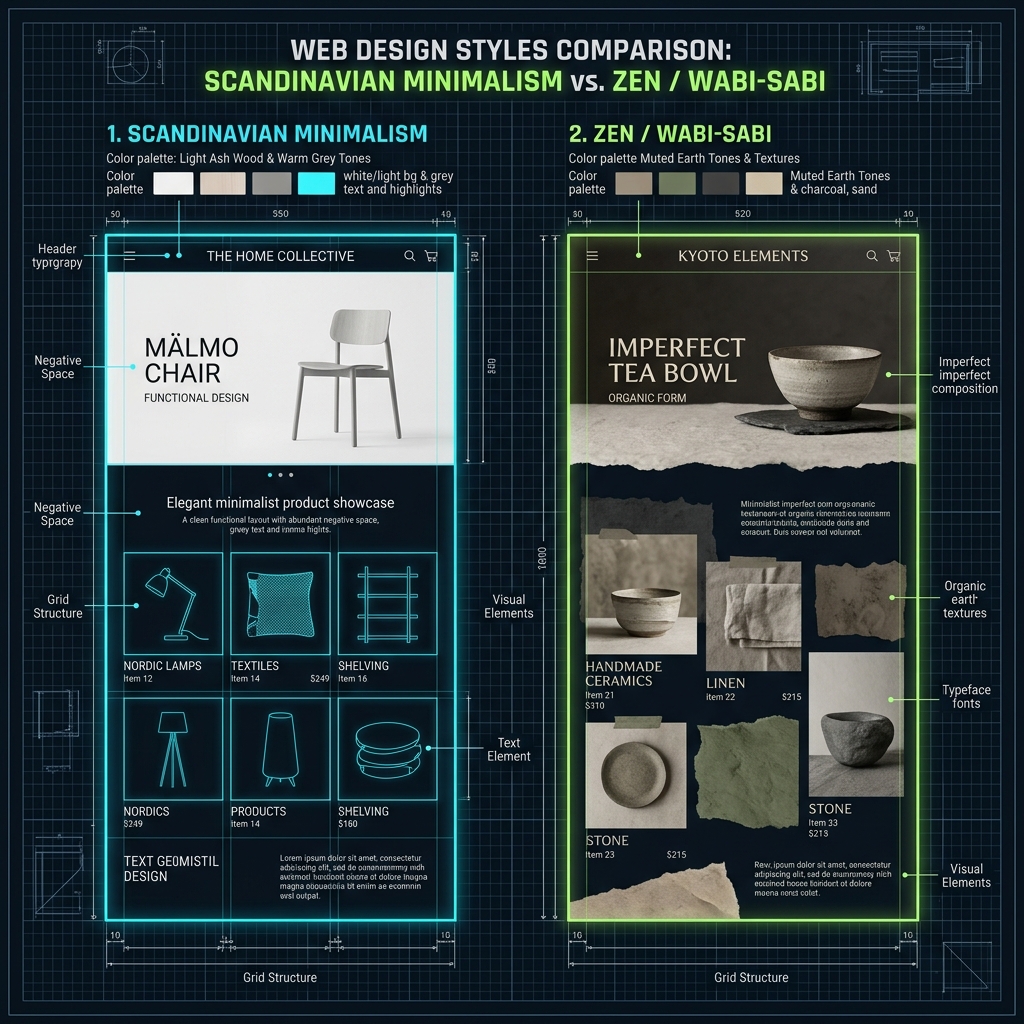
Selain itu, berikut adalah Cetak Biru Desain Minimalis Alami & Wabi-Sabi yang memvisualisasikan perbandingan tata letak antara kesederhanaan fungsi berlapis ruang luas (Scandinavian Minimalism) dengan keindahan asimetris bertekstur organik bumi (Zen / Wabi-Sabi):
1.2 Ultra-Minimal
| Style | Era | Penggunaan | Karakteristik Utama | Contoh |
|---|---|---|---|---|
| Brutalist Typography | 🟢 Modern | Agency, art portfolio, fashion | Type as hero element; Extreme scale contrast; No decorative imagery | Balenciaga, Bottega Veneta, The Row |
| White Space Design | 🟢 Modern | Premium SaaS, luxury, editorial | Intentional negative space; Content sparsity; Premium signal | Apple.com, Stripe.com, Arc browser |
Deskripsi:
- Brutalist Typography: Tipografi berukuran raksasa memenuhi layar tanpa gambar dekoratif; kontras skala ekstrem yang menonjolkan struktur murni.
- White Space Design: Ruang kosong yang luas dan disengaja; konten minimalis terpusat sebagai representasi eksklusivitas premium.
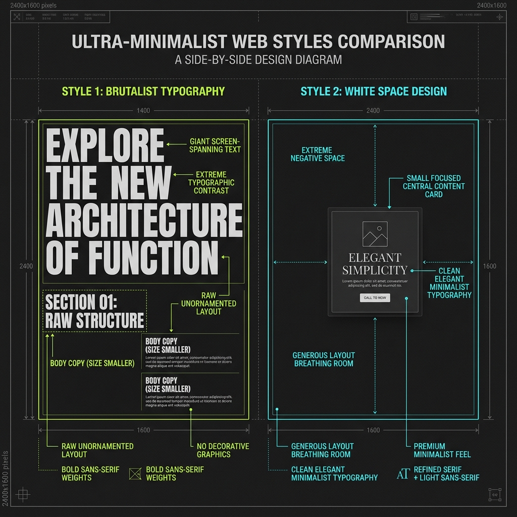
Berikut adalah Cetak Biru Desain Ultra-Minimal yang memperlihatkan perbandingan antara tipografi mentah skala ekstrem tanpa dekorasi grafik (Brutalist Typography) dengan pemanfaatan ruang kosong luas ber-konten minimalis terpusat (White Space Design):
2. Skeuomorphism & Realism
2.1 Realism & Texture
| Style | Era | Penggunaan | Karakteristik Utama | Contoh |
|---|---|---|---|---|
| Skeuomorphism | 🔵 Classic | Desktop apps, early mobile UI | Real-world material textures; 3D depth and lighting; Physical affordance cues | Early iOS, iBooks, Reminders pre-iOS 7 |
| Rich Visual Style (RVS) | 🔵 Classic | Gaming UI, theme app, entertainment | Ornamental decorative elements; Rich texture layering; Elaborate visual details | Game UI, WinAmp skins, theme-heavy apps |
| Photorealism | 🔵 Classic | Product showcase, e-commerce, 3D render | High-fidelity product photography; Photorealistic 3D render; Tactile material representation | Apple product pages, Behance 3D portfolios |
| Claymorphism | 🟢 Modern | Children's app, playful SaaS, mobile game | Puffy 3D clay-like shapes; Saturated color palette; Soft shadows and highlights | Dribbble 3D illustrations, iOS icon style |
| Retro 3D / Y2K 3D | 🟢 Modern | Music, youth brand, nostalgia campaign | Chrome and metallic sheen; Blobby organic 3D forms; Y2K nostalgia color palette | Charli XCX Brat aesthetic, pop music sites |
Deskripsi:
- Skeuomorphism: UI meniru objek dunia nyata: texture kayu, kulit, metal, stitching. Dominan era Steve Jobs di Apple.
- Rich Visual Style: Highly decorative dengan ornamen, texture, dan detail visual yang kaya.
- Claymorphism: 3D puffy 'clay' objects; warna jenuh, highlight yang jelas, dan shadow yang lembut.
- Retro 3D / Y2K 3D: Estetika 3D era 1990s-2000s: chrome, lens flare, gradient blobby shapes.
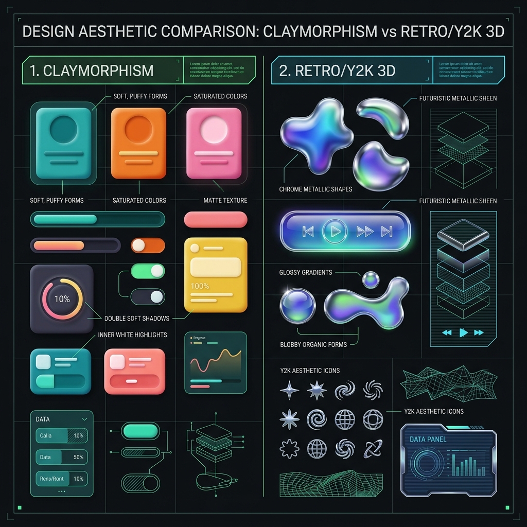
Berikut adalah Cetak Biru Estetika Claymorphism vs Retro 3D yang membandingkan kelembutan elemen mengembang semi-realistis (Claymorphism) dengan kilau metalik krom futuristis khas awal era milenium (Retro/Y2K 3D):
3. Brutalism & Anti-Design
3.1 Brutalist Web
| Style | Era | Penggunaan | Karakteristik Utama | Contoh |
|---|---|---|---|---|
| Web Brutalism | 🟢 Modern | Art portfolio, indie web, experimental | Raw HTML aesthetic; High contrast colors; Deliberate 'ugly' composition | Craigslist, Bloomberg Businessweek 2012, balenciaga.com |
| New Brutalism | 🟢 Modern | Fashion, music, Gen-Z brand | Oversized typography blocks; Flat color blocking; Assertive negative space | Virgil Abloh projects, Supreme, Palace |
| Deconstructivism | 🔴 Research | Art, experimental, anti-brand | Rule-breaking composition; Intentional visual chaos; Transgressive layout | David Carson's Ray Gun, experimental art sites |
| Anti-Design / Vernacular | 🟢 Modern | Zine, DIY, counter-culture brand | Intentional low-fi aesthetic; DIY zine composition; Vernacular typography | Ugly Design on Instagram, zine culture |
Deskripsi:
- Web Brutalism: Mengekspos raw HTML structure; tanpa ornamen, border kotak, monospace font, warna mencolok.
- New Brutalism: Lebih polished dari brutalism murni tapi masih retains raw energy; strong typography, flat blocks.
- Deconstructivism: Sengaja melanggar prinsip desain: teks rotated, overflow, overlapping tanpa hierarchy.
- Anti-Design: Meniru desain amatir yang disengaja; cut-and-paste aesthetic, typewriter font.
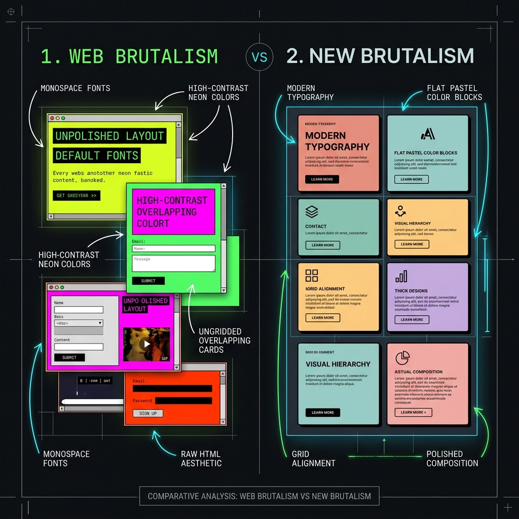
Berikut adalah Cetak Biru Perbandingan Web Brutalism vs New Brutalism yang membandingkan tata letak mentah tanpa dekorasi struktural HTML murni (Web Brutalism) dengan struktur blok warna datar berkomposisi rapi (New Brutalism):
3.2 Maximalism
| Style | Era | Penggunaan | Karakteristik Utama | Contoh |
|---|---|---|---|---|
| Maximalism | 🟢 Modern | Fashion, luxury, entertainment, art | Layered visual richness; Pattern on pattern; Expressive color saturation | Gucci old branding, luxury editorial |
| Psychedelic / Acid | 🔵 Classic | Music festival, countercultural, rave | Neon saturated palette; Distorted wavy forms; Optical illusion elements | 1960s concert posters, rave flyers |
Deskripsi:
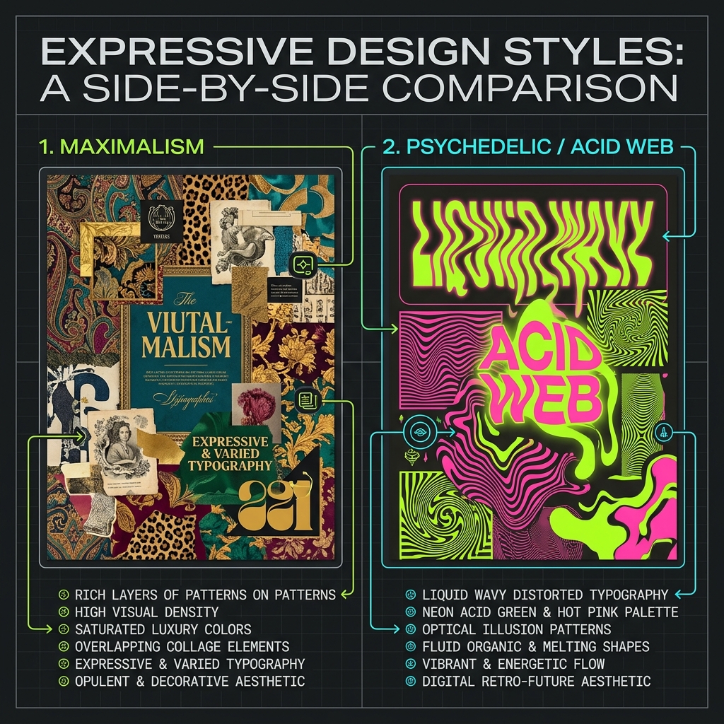
- Maximalism: Kepadatan visual tingkat tinggi dengan tumpukan pola (pattern on pattern), kolase elemen berlapis, dan kejenuhan warna mewah yang ekspresif.
- Psychedelic / Acid: Tipografi bergelombang cair yang terdistorsi, palet warna neon acid yang sangat jenuh, serta motif ilusi optik berpendar.
Berikut adalah Cetak Biru Desain Ekspresif Maximalism vs Psychedelic yang memperlihatkan perbandingan antara tumpukan pola mewah berkepadatan tinggi (Maximalism) dengan distorsi cairan tipografi neon berpendar acid (Psychedelic / Acid Web):
4. Retro & Historical Revivals
4.1 Modernist Revivals
| Style | Era | Penggunaan | Karakteristik Utama | Contoh |
|---|---|---|---|---|
| Bauhaus | 🔵 Classic | Design education, institutional, art | Primary color palette; Geometric basic forms; Function-first philosophy | Bauhaus centenary branding, Itten, Albers |
| Art Deco | 🔵 Classic | Luxury, hospitality, heritage brand | Geometric ornamental patterns; Gold and black palette; Vertical symmetry | Gatsby-era hotels, Cartier, luxury brands |
| Art Nouveau | 🔵 Classic | Cultural institution, organic brand | Organic flowing curves; Nature-derived ornament; Handcrafted typography | Toulouse-Lautrec posters, Mucha |
| Swiss Punk / New Wave | 🔵 Classic | Music, counter-culture, fashion | Layered compositions; Experimental type placement; Chaotic grid-breaking | Wolfgang Weingart, April Greiman |
| Constructivism | 🔵 Classic | Political art, social campaign, poster | Diagonal dynamic composition; Red black white palette; Photomontage technique | Soviet propaganda posters, El Lissitzky |
| De Stijl / Mondrian | 🔵 Classic | Brand identity, editorial, art | Primary color blocks; Horizontal vertical grid; Neoplastic composition | Mondrian, Rietveld Red-Blue Chair |
Deskripsi:
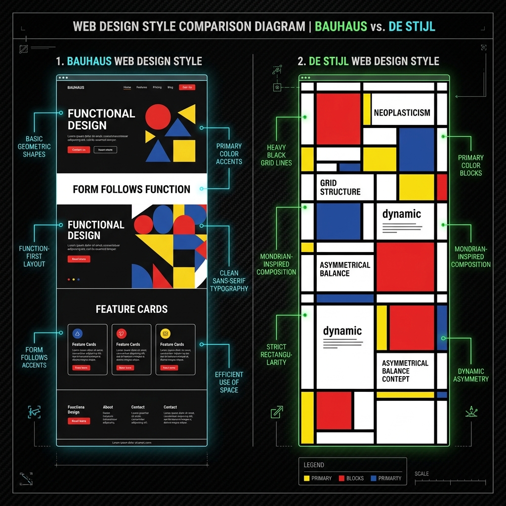
- Bauhaus: Bentuk dasar, tipografi fungsional, warna primer. Manifesto: form follows function.
- Art Deco: Geometric ornament, metallic palette, vertical symmetry, dan motif machine age.
- Art Nouveau: Organic flowing lines terinspirasi alam; floral motifs, sinuous curves.
- Swiss Punk / New Wave: Reaksi terhadap Swiss minimalism; layered, textured, experimental typography.
- Constructivism: Diagonal komposisi, merah-hitam-putih, fotomontage, tipografi bold.
- De Stijl: Garis horizontal-vertikal, warna primer, asimetri yang seimbang.
Berikut adalah Cetak Biru Desain Modernist Bauhaus vs De Stijl yang menunjukkan bentuk dasar geometris fungsional (Bauhaus) dan tata letak modular horizontal-vertikal berbasis asimetri warna primer (De Stijl):
4.2 Nostalgia Revivals
| Style | Era | Penggunaan | Karakteristik Utama | Contoh |
|---|---|---|---|---|
| Retro / Vintage | 🟢 Modern | Food & beverage, lifestyle, heritage | Faded vintage color palette; Distressed texture overlays; Classic serif typography | Americana brands, craft brewery, vintage shop |
| Y2K Aesthetic | 🟢 Modern | Fashion, music, youth brand, social media | Bubbly glossy elements; Silver chrome accents; Futuristic Y2K palette | Paris Hilton revival, Bratz dolls aesthetic |
| 90s Nostalgia / Vaporwave | 🟢 Modern | Music, gaming, internet culture | Purple pink teal palette; CRT scanline effects; Surreal nostalgic imagery | Vaporwave music covers, lo-fi hip-hop aesthetic |
| 8-bit / Pixel Art | 🟢 Modern | Gaming, indie, retro tech brand | Low-res pixel grid; Limited color palette; Retro game aesthetic | Minecraft, indie game sites, pixel art portfolio |
| Skeuomorphic Revival | 🟢 Modern | Audio plugin, musical instrument, niche tool | Deliberate material textures; Nostalgic digital realism; Warm tactile metaphors | Serato, Korg iOS apps, guitar pedal plugins |
| Lo-fi / Zine | 🟢 Modern | Independent creator, small brand, newsletter | Photocopier texture; Hand-drawn elements; Intentional imperfection | Are.na, indie zines, Substack newsletters |
Deskripsi:
- Retro / Vintage: Estetika klasik masa lalu dengan tekstur kertas usang, warna pudar, dan ornamen tradisional.
- Y2K Aesthetic: Estetika awal 2000-an yang memadukan futurisme gelembung plastik, aksen perak krom, dan optimisme digital.
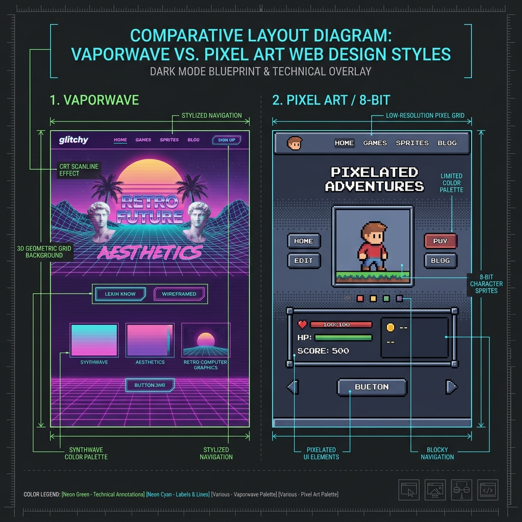
- 90s Nostalgia / Vaporwave: Pemanfaatan warna neon (ungu/merah muda/hijau toska), efek pemindaian layar tabung (CRT), dan patung klasik.
- 8-bit / Pixel Art: Batasan kisi piksel resolusi rendah yang membangkitkan nostalgia konsol game retro generasi awal.
- Skeuomorphic Revival: Kembalinya dial fisik, tekstur analog, dan kenop taktil di era modern sebagai metafora antarmuka.
- Lo-fi / Zine: Tekstur fotokopi bertinta kasar, elemen coretan tangan, dan ketidaksempurnaan artistik yang disengaja.
Berikut adalah Cetak Biru Desain Retro Vaporwave vs Pixel Art yang memperlihatkan perbandingan antara pemakaian pendaran neon CRT 3D grid (Vaporwave) dengan antarmuka terbatas resolusi kisi piksel 8-bit (Pixel Art):
5. Expressive & Brand-Led Design
5.1 Brand Expression
| Style | Era | Penggunaan | Karakteristik Utama | Contoh |
|---|---|---|---|---|
| Expressive Branding / Brand-Led Design | 🟢 Modern | Consumer brand, lifestyle, startup | Brand personality in every element; Custom illustration system; Ownable visual language | Mailchimp, Stripe, Duolingo, Notion |
| Illustration-Driven Design | 🟢 Modern | Onboarding, empty states, storytelling | Bespoke illustration system; Characters and narrative; Consistent illustration language | Duolingo, Headspace, Dropbox redesign |
| Motion-First Design | 🟢 Modern | Interaction design, premium app, consumer | Entrance and exit choreography; Physics-based spring motion; Purposeful animation language | Framer, Lottie animations, Google I/O |
| Bold Color Blocking | 🟢 Modern | Tech company, SaaS, young brand | Full-bleed color sections; High contrast color pairs; Brand color as primary canvas | Figma, Notion, Framer, Linear |
| Custom Type Design | 🟢 Modern | Premium brand, fashion, media | Proprietary brand typeface; Type as brand signature; Distinctive letterform personality | The Guardian (Guardian typeface), Netflix (Netflix Sans) |
Deskripsi:
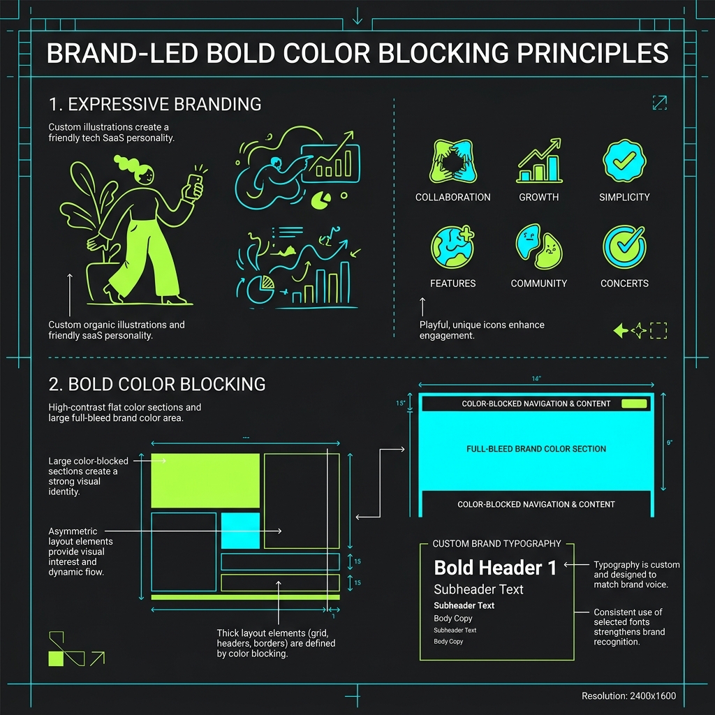
- Expressive Branding: Seluruh UI adalah ekspresi brand; setiap warna, font, motion adalah keputusan brand bukan utilitas.
- Illustration-Driven: Custom illustration sebagai UI component utama; bukan hanya dekorasi.
- Motion-First: Motion adalah primary design decision, bukan afterthought; setiap state punya choreography.
- Bold Color Blocking: Blok warna solid yang besar dan kontras; brand color sebagai background penuh.
- Custom Type Design: Typeface custom yang dibuat khusus untuk brand; identitas lewat tipografi.
Berikut adalah Cetak Biru Desain Ekspresif & Color Blocking yang memperlihatkan perpaduan antara ilustrasi kustom penunjuk karakter brand (Expressive Branding) dengan pembagian tata letak berwarna kontras tanpa bayangan (Bold Color Blocking):
5.2 Niche Expressive
| Style | Era | Penggunaan | Karakteristik Utama | Contoh |
|---|---|---|---|---|
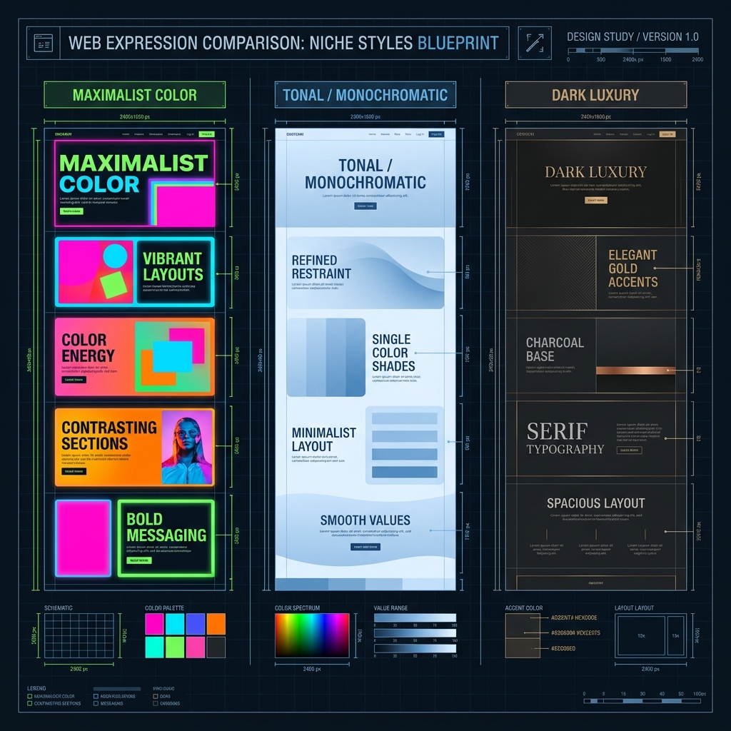
| Maximalist Color | 🟢 Modern | Gen-Z brand, social media, entertainment | Hyper-saturated palette; Color as personality; Anti-neutral stance | Glossier, Depop, youth fashion brands |
| Tonal / Monochromatic | 🟢 Modern | Luxury, premium, refined brand | Single hue tonal system; Subtle value progression; Premium restraint signal | Hermès, Bang & Olufsen, Sonos |
| Dark Luxury | 🟢 Modern | Premium service, fintech, luxury product | Dark matte background; Metallic accent colors; Restrained whitespace on dark | Rolls-Royce, high-end fintech, black card |
Deskripsi:
- Maximalist Color: Penggunaan warna-warna neon hiper-jenuh yang sangat kontras sebagai penunjuk identitas utama.
- Tonal / Monochromatic: Sistem pewarnaan berskala tunggal (monokrom) dengan gradasi nilai warna yang sangat halus untuk memberikan kesan tenang dan premium.
- Dark Luxury: Latar belakang gelap pekat (matte) berpadu aksen logam mulia (emas/tembaga) dengan tipografi serif elegan dan ruang bernafas yang lapang.
Berikut adalah Cetak Biru Desain Ekspresif Niche yang memperlihatkan perbandingan tata letak blok warna jenuh ekstrem (Maximalist Color), keteraturan gradasi satu warna (Tonal / Monochromatic), hingga kemewahan latar gelap dengan aksen metalik presisi (Dark Luxury):
6. Typography-Led Design
6.1 Type as Interface
| Style | Era | Penggunaan | Karakteristik Utama | Contoh |
|---|---|---|---|---|
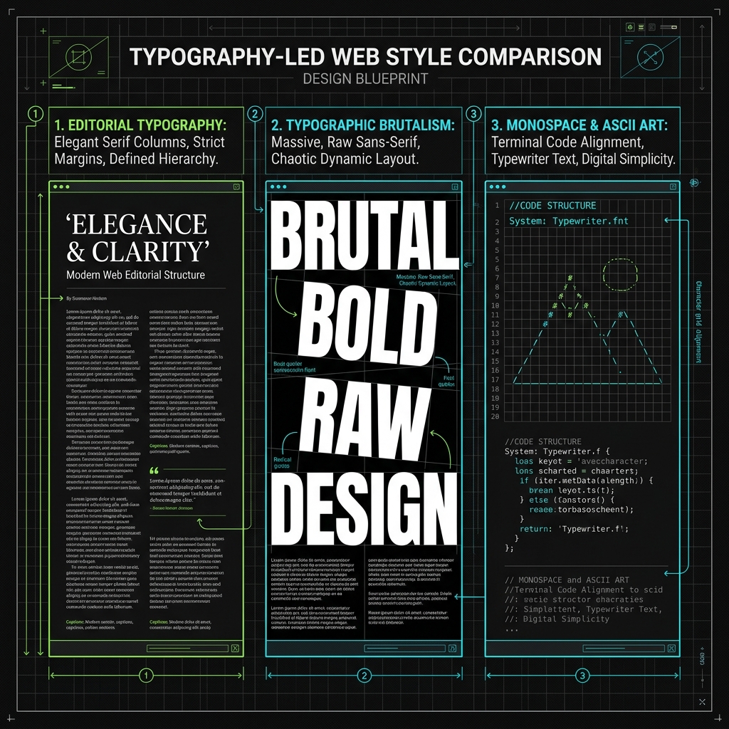
| Editorial Typography | 🟢 Modern | Digital magazine, long-form, journalism | Scale as visual hierarchy; Weight contrast for rhythm; Column width for readability | Medium, Substack, The Atlantic |
| Typographic Brutalism | 🟢 Modern | Fashion, art, manifesto, campaign | Viewport-scale letterforms; Single statement typography; Type as visual art | Bottega Veneta, Margiela campaigns |
| Variable Font Expressivism | 🔴 Research | Interactive editorial, creative coding | Responsive font axes; Scroll/hover-driven variations; Type as reactive element | Dinamo type foundry, Google Fonts variable |
| Kinetic Typography | 🟢 Modern | Video-style web, agency, brand film | Text animation sequences; GSAP/Framer text motion; Typographic micro-drama | Nike campaigns, award-winning agency sites |
| ASCII Art / Text-Based | 🟢 Modern | Developer tool, indie web, terminal aesthetic | Character-grid composition; Monospace font foundation; Terminal cultural reference | GitHub CLI, developer portfolio, hacker aesthetic |
Deskripsi:
- Editorial Typography: Tipografi adalah interface utama; skala, weight, dan rhythm menciptakan seluruh hierarchy.
- Typographic Brutalism: Tipografi sangat besar, bold, occupying full viewport; sering dengan single word atau phrase.
- Variable Font Expressivism: Variable font axis digunakan sebagai expressive medium; weight dan width berubah per interaction.
- Kinetic Typography: Teks yang bergerak, morph, rotate, atau fade; seperti motion graphic di dalam browser. Berikut adalah Cetak Biru Desain Tipografi sebagai Antarmuka yang memperlihatkan perbandingan tata letak antara keteraturan struktur kolom serif majalah (Editorial Typography), teks mentah sans-serif raksasa tanpa grafis (Typographic Brutalism), hingga susunan baris kode terstruktur bermuatan ilustrasi karakter (Monospace & ASCII Art):
6.2 System Typography
| Style | Era | Penggunaan | Karakteristik Utama | Contoh |
|---|---|---|---|---|
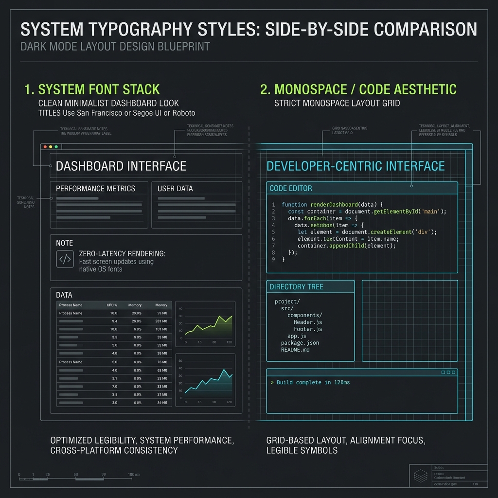
| System Font Stack | 🟢 Modern | Performance-first app, CMS, utilitarian | Zero font loading latency; Platform-native familiarity; System consistency | GitHub, Wikipedia, utilitarian apps |
| Monospace / Code Aesthetic | 🟢 Modern | Developer tool, terminal, tech brand | Monospace grid alignment; Code syntax highlighting; Terminal-native visual language | GitHub, VS Code, Vercel CLI, Replit |
Deskripsi:
- System Font Stack: Menggunakan tumpukan font bawaan sistem operasi (seperti San Francisco, Segoe UI, Roboto) untuk menjamin latensi rendering nol dan tampilan antarmuka yang ramah pengguna.
- Monospace / Code Aesthetic: Penggunaan tata letak kisi berjarak sama (monospace), editor baris kode dengan pewarnaan sintaks, serta arsitektur direktori khas pengembang.
Berikut adalah Cetak Biru Desain Tipografi Sistem yang memperlihatkan perbandingan tata letak antara dasbor bersih berbasis font bawaan sistem (System Font Stack) dengan modul baris kode pengembang berstruktur monospace (Monospace / Code Aesthetic):
7. Layout Systems & Grid
7.1 Grid Systems
| Style | Era | Penggunaan | Karakteristik Utama | Contoh |
|---|---|---|---|---|
| 12-Column Grid | 🔵 Classic | All web — standard responsive layout | 12 equal columns; Gutter-based spacing; Breakpoint responsive | Bootstrap, Foundation, most CSS frameworks |
| Modular Grid | 🔵 Classic | Print-to-web, editorial, magazine | Row and column module units; Strict alignment zones; Print-derived precision | Typographic grid systems, editorial web |
| Asymmetric Grid | 🟢 Modern | Agency, portfolio, editorial | Unequal column widths; Dynamic visual tension; Intentional imbalance | awwwards winners, editorial portfolios |
| Fluid / Intrinsic Layout | 🟢 Modern | Responsive design, app UI | CSS Grid intrinsic sizing; No arbitrary breakpoints; Content-driven sizing | Modern CSS (Jen Simmons), Heydon Pickering |
| Masonry Layout | 🟢 Modern | Image gallery, Pinterest-style, portfolio | Variable-height items; Column-fill algorithm; Gallery-optimized density | Pinterest, Unsplash, image portfolio sites |
| Bento Grid | 🔥 Tren | Product page, portfolio, feature showcase | Asymmetric cell sizing; Mixed aspect ratios; Feature card system | Apple.com features, Linear, Raycast |
| Single-Column Editorial | 🟢 Modern | Long-form article, newsletter, blog | Optimal measure (65ch); Generous leading; Distraction-free reading | Medium, Substack, personal blog |
Deskripsi:
- 12-Column Grid: Grid 12 kolom sebagai standar responsif; Bootstrap mempopulerkannya. Flexible dan universal.
- Modular Grid: Grid dengan modul baris DAN kolom; lebih presisi untuk editorial layout.
- Asymmetric Grid: Kolom dengan lebar tidak sama; menciptakan visual tension yang dinamis.
- Fluid / Intrinsic Layout: Menggunakan CSS Grid dan Flexbox untuk layout yang truly fluid tanpa breakpoint.
- Masonry Layout: Kolom vertikal dengan item berketinggian variabel; diisi dari atas.
- Single-Column Editorial: Satu kolom konten sempit dengan line-length optimal (60-75 karakter); reading-optimized.
- Bento Grid: Sistem sel kisi asimetris dengan rasio aspek bervariasi yang mengelompokkan beragam fitur atau informasi ke dalam modul-modul kartu teratur.
Berikut adalah Cetak Biru Desain Sistem Grid Modern yang memperlihatkan visualisasi Bento Grid asimetris terstruktur rapat yang membagi setiap bagian konten ke dalam modul kartu secara dinamis (Bento Grid):
7.2 Spatial Navigation
| Style | Era | Penggunaan | Karakteristik Utama | Contoh |
|---|---|---|---|---|
| Card-Based UI | 🟢 Modern | Dashboard, content platform, app | Content container units; Variable density options; Action-surface affordance | Material Design, Notion, Trello |
| Infinite Scroll | 🟢 Modern | Social media, news feed, content stream | Continuous content stream; Lazy-load implementation; Infinite engagement loop | Twitter/X, Instagram, TikTok web |
| Sticky/Fixed Navigation | 🟢 Modern | Most modern websites | Viewport-anchored nav; Scroll-progress indicator; Always-accessible actions | Nearly all modern web apps |
| Spatial / Canvas UI | 🔴 Research | Design tool, mind map, creative app | Infinite canvas space; Pan and zoom interaction; Freeform element placement | Figma, Miro, Excalidraw, FigJam |
Deskripsi:
- Card-Based UI: Pengelompokan konten ke dalam kontainer kartu dengan tingkat kepadatan variabel untuk kejelasan fungsi interaksi.
- Infinite Scroll: Aliran konten tanpa akhir yang memuat data secara dinamis berdasarkan scroll pengguna (lazy-load).
- Sticky/Fixed Navigation: Menu navigasi yang selalu menempel di layar untuk akses interaksi yang instan.
- Spatial / Canvas UI: Ruang kerja kanvas tanpa batas (infinite canvas) dengan navigasi geser (pan) dan perbesaran (zoom) bebas letak.
Berikut adalah Cetak Biru Desain Antarmuka Spasial & Kanvas yang memvisualisasikan arsitektur penempatan jendela melayang berlapis kedalaman ruang (Spatial UI VisionOS):
8. Motion & Interaction Design
8.1 Animation Systems
| Style | Era | Penggunaan | Karakteristik Utama | Contoh |
|---|---|---|---|---|
| Page Transitions | 🟢 Modern | SPA, portfolio, app | Cross-page element morphing; Orchestrated exit/enter; Route-based animation | Framer, Next.js transitions, Locomotive |
| Scroll-Triggered Animation | 🟢 Modern | Landing page, marketing, case study | IntersectionObserver-based; Staggered reveal timing; Parallax depth layers | GSAP ScrollTrigger, AOS library, awwwards |
| Lottie / After Effects Export | 🟢 Modern | Onboarding, illustration animation, loading | Vector-based animation; Frame-level control; Tiny file size | Duolingo, Airbnb animations |
| Physics-Based UI | 🟢 Modern | Premium mobile web, consumer app | Spring mass-damping model; Natural deceleration curves; Touch-responsive physics | Framer Motion spring, iOS rubberbanding |
| GSAP-driven Storytelling | 🟢 Modern | Agency, product launch, campaign | Timeline-sequenced animation; Cross-browser consistency; High-performance DOM | awwwards SOTM winners, Stripe homepage |
| CSS Houdini / Worklet | 🔴 Research | Advanced creative coding, experimental | Custom CSS properties; Paint worklet patterns; Layout worklet algorithms | Chrome experiments, CSS Houdini demos |
Deskripsi:
- Page Transitions: Animasi saat pindah halaman; fade, slide, morph, atau shared element transition.
- Scroll-Triggered Animation: Elemen muncul atau berubah saat masuk viewport; reveal on scroll.
- Lottie: After Effects animation diekspor sebagai Lottie JSON; lightweight dan scalable.
- Physics-Based UI: Spring physics, mass, damping untuk animasi yang terasa natural dan 'alive'.
- GSAP Storytelling: GreenSock Animation Platform untuk complex timeline dan sequence animation.
- CSS Houdini: Paint dan animation worklet untuk custom CSS rendering; full GPU access.
8.2 Interaction Paradigms
| Style | Era | Penggunaan | Karakteristik Utama | Contoh |
|---|---|---|---|---|
| Gesture UI | 🟢 Modern | Mobile web, touch-first app | Swipe gesture navigation; Pinch-to-zoom standard; Drag-and-drop touch | Mobile Instagram, iOS-style web apps |
| Voice UI (VUI) | 🟢 Modern | Smart speaker web, assistant, accessibility | Voice command activation; Visual confirmation feedback; Accessibility-first design | Google Assistant web, Alexa skill UI |
| Cursor-Based Interaction | 🟢 Modern | Agency, portfolio, immersive web | Custom cursor states; Magnetic cursor effects; Cursor-driven reveals | awwwards portfolios, agency sites |
| Eye-Gaze / Head Tracking | 🔴 Research | Accessibility, spatial computing | Gaze dwell interaction; Head tilt control; Accessibility-first focus | Apple Vision Pro, eye-tracking accessibility |
9. Color & Visual System
9.1 Color Philosophy
| Style | Era | Penggunaan | Karakteristik Utama | Contoh |
|---|---|---|---|---|
| Color System Design | 🟢 Modern | Design system, product team | Token-based color system; Semantic alias layers; Dark/light mode tokens | Radix Colors, Tailwind, Figma tokens |
| Accessible Color (WCAG) | 🟢 Modern | Government, enterprise, inclusive design | Contrast ratio compliance; Non-color information cues; Screen reader optimization | GOV.UK Design System, IBM Carbon |
| Dark Mode Design | 🟢 Modern | Developer tool, night-use app, premium | Purpose-built dark tokens; Reduced luminance surfaces; Dark-optimized imagery | Linear, GitHub, VS Code, Arc |
| Adaptive Color / Dynamic Theme | 🟢 Modern | Personalized app, consumer product | Wallpaper color extraction; Time-of-day adaptation; User preference tokens | Android Material You, iOS dynamic color |
Deskripsi:
- Color System Design: Systematic semantic color token; primitive → semantic → component level.
- Accessible Color: Color contrast minimum WCAG AA (4.5:1) dan AAA (7:1); color tidak sebagai satu-satunya information.
- Dark Mode Design: Dark palette sebagai first-class citizen; bukan hanya invert dari light mode. Berikut adalah Cetak Biru Desain Sistem & Filosofi Warna yang memperlihatkan implementasi skema warna ekspresif dari palet jenuh kontras tinggi (Maximalist Color), keteraturan gradasi satu warna (Tonal / Monochromatic), hingga tema gelap mewah presisi (Dark Luxury):
9.2 Surface Treatment
| Style | Era | Penggunaan | Karakteristik Utama | Contoh |
|---|---|---|---|---|
| Glassmorphism | 🔥 Tren | Dashboard, SaaS UI, overlay | backdrop-filter blur; Semi-transparent surface; Light border highlight | Apple Big Sur, Windows 11 Fluent |
| Neomorphism | 🔥 Tren | Widget, card, form element | Monochromatic palette; Dual directional shadow; Concave/convex surfaces | Soft UI design kits, Dribbble shots |
| Flat 2.0 | 🟢 Modern | App UI, icon, web component | Subtle depth hints; Flat-first with shadow accent; Clean but not austere | Google Material, Microsoft Fluent |
| Aurora / Mesh Gradient | 🔥 Tren | SaaS landing page, hero section | Organic gradient flow; Multiple color blend points; Atmospheric depth | Stripe, Vercel, linear gradient hero sections |
Deskripsi:
- Glassmorphism: Efek permukaan transparan menyerupai kaca buram menggunakan
backdrop-filter: blur, serta sorotan garis tepi putih tipis.- Neomorphism: Gaya desain tiga dimensi lembut (soft UI) menggunakan bayangan ganda (dual directional shadow) cembung dan cekung dengan warna monokrom.
- Flat 2.0: Evolusi dari flat design klasik yang menambahkan aksen bayangan tipis dan gradasi halus untuk memberikan petunjuk kedalaman interaksi.
- Aurora / Mesh Gradient: Perpaduan warna organik cair (mesh gradient) berpendar lembut yang membaur di latar belakang untuk memberikan kedalaman atmosfer.
Berikut adalah Cetak Biru Desain Perlakuan Permukaan Modern yang memperlihatkan visualisasi efek kaca buram melayang (Glassmorphism) dan efek tombol fisik timbul lembut (Neomorphism):
10. Data Visualization & Dashboard
10.1 Dashboard Design
| Style | Era | Penggunaan | Karakteristik Utama | Contoh |
|---|---|---|---|---|
| Analytics Dashboard | 🟢 Modern | SaaS metric, business intelligence | Information density optimization; Chart type selection; Real-time data binding | Grafana, Datadog, Amplitude |
| Narrative Data Viz | 🟢 Modern | Journalism, public report, explainer | Single-message chart design; Annotation-driven insights; Reader-first accessibility | FiveThirtyEight, The Economist, NYT charts |
| Scrollytelling Data | 🔥 Tren | Long-form journalism, interactive report | Scroll-synchronized chart states; Animated transitions between states; Story-driven data sequence | The Pudding, NYT Upshot, Pudding.cool |
| Real-time Dashboard | 🟢 Modern | Monitoring, DevOps, trading, IoT | Live data streaming; Alert threshold visualization; Time-series dominant layout | Grafana, Datadog, Bloomberg Terminal |
| Generative / Creative Data Viz | 🔴 Research | Art, research, communication | Non-standard chart forms; Aesthetic data representation; Emotional data communication | Giorgia Lupi, Nadieh Bremer, Flowing Data |
Deskripsi:
- Analytics Dashboard: Dense information layout; charts, KPI cards, dan tables dalam satu viewport.
- Narrative Data Viz: Data visualization yang bercerita; chart didesain untuk satu insight spesifik.
- Scrollytelling Data: Chart dan visualisasi berubah seiring scroll narasi.
- Real-time Dashboard: Data berubah secara real-time; refresh rate tinggi, alert-driven design.
- Generative Data Viz: Data divisualisasikan sebagai ekspresi artistik; chart tidak konvensional.
Berikut adalah Cetak Biru Desain Antarmuka Dashboard Padat Data yang memperlihatkan visualisasi data berkepadatan tinggi, penataan kartu metrik (Analytics Dashboard), serta skema arsitektur panel modular presisi (Technical Blueprint System):
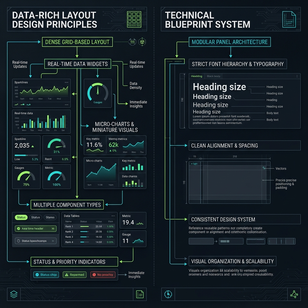
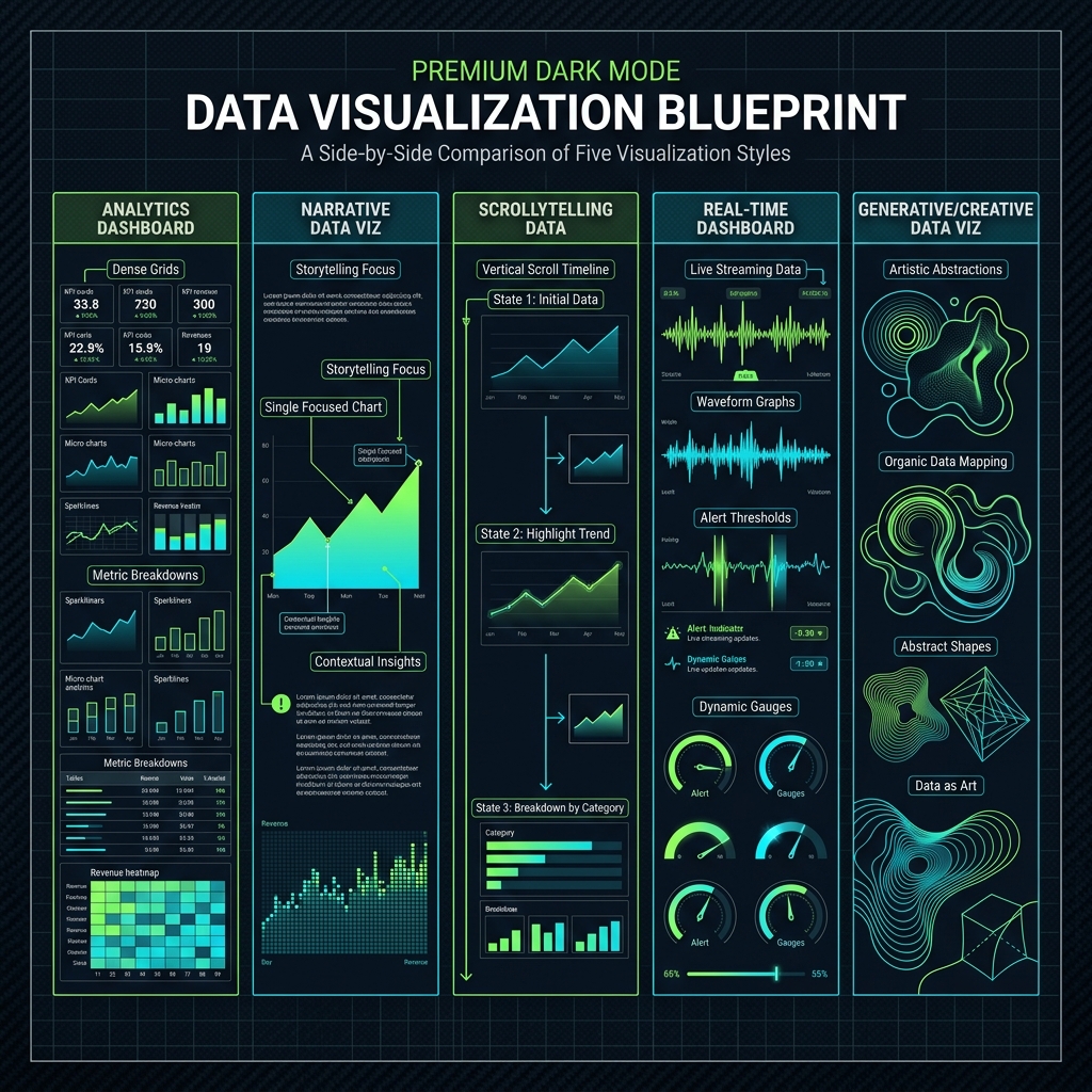
Selain itu, berikut adalah Cetak Biru Perbandingan Desain Visualisasi Data yang memperlihatkan prinsip tata letak komparatif dari kelima gaya visualisasi utama mulai dari model grid terstruktur padat (Analytics Dashboard), fokus narasi ber-anotasi (Narrative Data Viz), transisi wujud data linear per scroll (Scrollytelling Data), sumbu gelombang waktu-nyata (Real-time Dashboard), hingga pemetaan seni organik abstrak (Generative/Creative Data Viz):
11. Accessibility & Inclusive Design
11.1 Inclusive Design Principles
| Style | Era | Penggunaan | Karakteristik Utama | Contoh |
|---|---|---|---|---|
| Universal Design | 🔵 Classic | Government, public service, education | Equitable use design; Perceptible information; Flexible use modes | GOV.UK, USA.gov, W3C Web Accessibility |
| WCAG-Compliant Design | 🟢 Modern | All public-facing web, regulated industry | Contrast ratio compliance; Keyboard navigability; Screen reader semantics | IBM Carbon, GOV.UK Design System |
| Cognitive Accessibility Design | 🟢 Modern | Healthcare, education, neurodiversity | Plain language principle; Error prevention design; Consistent navigation patterns | NHS Digital, Simple.gov |
| Motor Accessibility / Large Touch Target | 🟢 Modern | Mobile, elderly user, motor disability | 44px minimum touch target; Voice/switch control support; Head pointer compatible | Apple HIG touch guidelines, WCAG 2.5 |
Deskripsi:
- Universal Design: Desain untuk semua kemampuan; 7 principles (equitable, flexible, simple, perceptible, tolerant, low effort, size-space).
- WCAG-Compliant: Meeting Web Content Accessibility Guidelines (A, AA, AAA); perceivable, operable, understandable, robust.
- Cognitive Accessibility: Desain untuk cognitive load reduction; clear language, predictable patterns, progressive disclosure.
- Motor Accessibility: Touch target minimum 44×44px; alternative interaction modes.
12. Immersive & Emerging Interfaces
12.1 Spatial & XR
| Style | Era | Penggunaan | Karakteristik Utama | Contoh |
|---|---|---|---|---|
| WebXR / WebAR | 🔴 Research | Product visualization, AR experience, metaverse | Browser-native XR; No-install AR experience; Spatial content placement | Google WebAR, Zappar, 8th Wall |
| Spatial UI (visionOS style) | 🔥 Tren | Apple Vision Pro, spatial computing | Floating window panels; Eye + pinch interaction; Spatial audio anchors | Apple visionOS, Meta Quest overlay UI |
| Metaverse UI | 🔴 Research | Virtual world, gaming, social VR | 3D persistent world UI; Avatar-based social interface; In-world HUD elements | Roblox, Decentraland, Meta Horizon |
| Holographic UI | 🔴 Research | Mixed reality, HoloLens, projection | Holographic depth perception; Hand gesture input; Real-world anchoring | Microsoft HoloLens, mixed reality dev |
12.2 Experimental Web
| Style | Era | Penggunaan | Karakteristik Utama | Contoh |
|---|---|---|---|---|
| Creative Coding / Canvas | 🟢 Modern | Portfolio, art, interactive experiment | Generative art systems; Real-time rendering; Code as artistic medium | p5.js gallery, Three.js examples, CodePen art |
| Ambient / Calm Technology | 🔴 Research | Wellness app, peripheral display, IoT | Peripheral attention design; Non-interruptive notification; Calm information display | Apple Watch complications, ambient displays |
| Tangible UI | 🔴 Research | Physical computing, installation, education | Physical object as interface; Mixed physical-digital space; Tangible affordance design | MIT Tangible Media Group, Reactable |
| Brain-Computer Interface UI | 🔴 Research | Medical, accessibility, neurotechnology | Neural signal input; Mental command execution; Minimal visual feedback loop | Neuralink concept UI, BCI research prototypes |
Deskripsi:
- WebXR / WebAR: Augmented dan Virtual Reality melalui browser tanpa install; WebXR API.
- Spatial UI: UI mengambang dalam ruang 3D; window depth, glass panels, eye tracking.
- Metaverse UI: UI dalam lingkungan 3D persistent; avatar-mediated interaction.
- Creative Coding: p5.js, Three.js, WebGL untuk generative visual dan creative coding dalam browser.
- Ambient / Calm Technology: UI yang ada di pinggiran perhatian; tidak menuntut fokus penuh.
- BCI UI: UI yang dikendalikan melalui neural signal; EEG-based interaction.
13. Performance & Engineering-Led Design
13.1 Performance-First
| Style | Era | Penggunaan | Karakteristik Utama | Contoh |
|---|---|---|---|---|
| Progressive Web App (PWA) Design | 🟢 Modern | App-like web experience | Offline-first design patterns; Install prompt UX; App-shell architecture | Twitter Lite, Starbucks PWA, Pinterest |
| Server-Side Rendering (SSR) UX | 🟢 Modern | E-commerce, news, performance-critical | Instant content visibility; No skeleton loader flash; SEO-friendly HTML-first | Next.js sites, Remix apps, SvelteKit |
| Skeleton Screen Pattern | 🟢 Modern | Content-heavy app, social platform | Content-shaped placeholders; Perceived performance optimization; Loading state UX | LinkedIn, Facebook, YouTube loading state |
| Optimistic UI Pattern | 🟢 Modern | Social app, real-time tool | Immediate state update; Background sync confirmation; Rollback on failure | Gmail send, Like button, messaging apps |
| Atomic CSS / Utility-First | 🟢 Modern | Large team, design system, performance | Single-purpose utility classes; No CSS specificity wars; PurgeCSS for minimal bundle | Tailwind CSS, UnoCSS, Tachyons |
| Design Token System | 🟢 Modern | Multi-platform design system | Primitive to component tokens; Cross-platform consistency; Automated theme generation | Figma Tokens, Style Dictionary, Theo |
Deskripsi:
- PWA Design: Offline-capable, installable, push notification; app UX tanpa app store.
- SSR UX: Mendesain untuk immediate content visibility; no loading state, instant first paint.
- Skeleton Screen: Loading placeholder yang sesuai bentuk konten; lebih baik dari spinner.
- Optimistic UI: UI update langsung sebelum server konfirmasi; rollback jika gagal.
- Atomic CSS: CSS utility classes; Tailwind CSS mempopulerkan pendekatan ini.
- Design Token System: Token primitif → semantic → komponen; satu sumber kebenaran untuk semua platform.
Ringkasan Statistik
| Kategori | Jumlah Style |
|---|---|
| 🔥 Sedang tren saat ini (2024–2025) | 16 |
| Minimalism & Flat Design | 9 |
| Skeuomorphism & Realism | 5 |
| Brutalism & Anti-Design | 6 |
| Retro & Historical Revivals | 12 |
| Expressive & Brand-Led Design | 8 |
| Typography-Led Design | 7 |
| Layout Systems & Grid | 11 |
| Motion & Interaction Design | 10 |
| Color & Visual System | 8 |
| Data Visualization & Dashboard | 5 |
| Accessibility & Inclusive Design | 4 |
| Immersive & Emerging Interfaces | 8 |
| Performance & Engineering-Led Design | 6 |
| Total | ~115 style unik |
Catatan: Beberapa style muncul di lebih dari satu kategori (misalnya Bento Grid ada di Tren dan Layout, Glassmorphism ada di Tren dan Color System). Total unik sekitar 115 style.
Glosarium Era
| Kode | Arti |
|---|---|
| 🔵 Classic | Style yang sudah established dan teruji waktu (umumnya sebelum 2010) |
| 🟢 Modern | Style yang aktif digunakan industri saat ini (2010–2023) |
| 🔴 Research/Frontier | Style yang masih dalam eksplorasi atau adopsi awal; belum mainstream |
| 🔥 Sedang Tren | Style yang dominan dan banyak diperbincangkan di 2024–2025 |
Referensi & Sumber Lanjutan
Tools & Resources
- Awwwards — awwwards.com — Showcase desain web terbaik dunia
- Dribbble — dribbble.com — Design inspiration & trends
- Behance — behance.net — Portfolio & case studies
- The Pudding — pudding.cool — Scrollytelling & data viz excellence
- CSS-Tricks — css-tricks.com — CSS & web design techniques
- Smashing Magazine — smashingmagazine.com — Web design best practices
- Figma Community — figma.com/community — Free UI kits dan style references
Design System References
- Material Design 3 — m3.material.io
- Apple HIG — developer.apple.com/design
- IBM Carbon — carbondesignsystem.com
- GOV.UK Design System — design-system.service.gov.uk
- Radix UI Colors — radix-ui.com/colors
- Tailwind CSS — tailwindcss.com
Standards & Guidelines
- WCAG 2.2 — w3.org/WAI/WCAG22
- WebXR API — immersiveweb.dev
- CSS Houdini — houdini.how
- Variable Fonts — v-fonts.com
- Lottie Animation — lottiefiles.com
Buku & Bacaan
- The Elements of Typographic Style — Robert Bringhurst
- Thinking with Type — Ellen Lupton
- Universal Principles of Design — Lidwell, Holden & Butler
- Don't Make Me Think — Steve Krug (usability)
- Designing with Data — Rochelle King et al.
- The Visual Display of Quantitative Information — Edward Tufte
- Motion Design — Matthew Friedman